How effective is the combination of your main product and ancillary text? (Poster and Magazine)
When creating the ancillary texts we had to relate it to our main product. Our trailer was in black and white so we had to follow the conventions of a film noir using.

How effective is the combination of your main product and ancillary text?
Our main product and ancillary texts are all different yet all relating to the same film. When working on our ancillary texts, we had to research the different techniques and elements of what makes a good film noir poster/magazine.
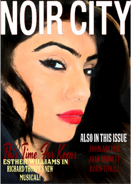
The picture of our magazine cover is the actress in our film product Nikita Basi. We used the magazine title Noir City. Noir city tend to use the same characteristics of actor and present them on the front cover to give people a taste of what the film will be about so in some way the magazine promotes the film. By adding sub-titles in the magazine, it makes it seem more like it is a 1940's magazine because it has actors and musicals from that time.
The front cover picture in the magazine of Nikita was influenced by Angelina Jolie's black and white picture with the hat covering half her face and her trench coat collars are up. However, instead of making it exactly alike, we decided to make ours in colour. This is because in film noir magazines or posters, they were mostly sketched in colour especially at that time when film noirs were being produced. So by using, photoshop, we edited the photo to make it seem sketched. We went to filter and selected the artistic tool and we could pick from a range of choices but in the end we chose the smudge stick effect. The magazine showed the character of the femme fatale. We wanted this to be obvious as we had a sub-title on the magazine saying 'Best American Femme Fatales of The Year' and Nikita's picture shows that she should be in that category as she is the front cover of the magazine.
After learning later that film noir posters and magazines are in colour, for our poster we originally had it in black and white so we had to change this and adjust the photo to colour. We had some issues with our poster in the beginning because we had to relate it to the convention of a film noir poster. We saw that most typical film noir posters were colourful, big, bold and bright, whereas ours originally was not. When we started ours, it was dark and dull except for the titles. This didn't look right so we went back and did more research on film noir posters. Also in the film poster we kept the font of the title the same so that people are familiarised with the film. Also, we added inter-titles so that people are a little more aware of what the film will be about. In most part of the trailer, Nikita seems to be more in control and the dominant character as the voice over describes Nikita as evil and described as a top femme fatale but in the end of the trailer Harman shoots a gun which may confuse the audience as to what is going on. On our poster, there is the catch phrase 'She can't hide for long' which then makes it clear as to why we called the film Revenge.

